Simple Fantasy Hockey Data Visualization in R
January 02, 2018
Anything in Excel beyond a simple scatterplot with two categories is frustrating to implement. R is much better and I have been using it for my fantasy hockey team this year.
In my current fantasy hockey league we play weekly matchups with 10 categories (i.e. if in a week your team’s stats are higher than your opponent’s you win a category, the team with the most won categories wins the match).
Here is a simple R script using plotly that filters players to get the highest point producers in the league and then plots points per game vs. power play points per game, with the colour of each marker determined by hits per game. I find using graphs like this helpful to identify outliers. For example in this plot it is clear that a relatively high even strength & power play point producing player who gets lots of hits is Dustin Brown (Dustin Byfuglien also looks good).
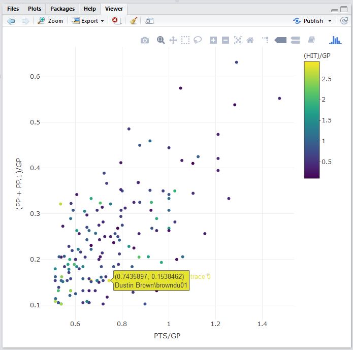
Data as of 01/02/2018 from www.hockey-reference.com