World Cup 2018 - Who is Toronto Cheering For?
June 15, 2018
Toronto, being the multicultural city that it is, takes the World Cup very seriously. But who is Toronto cheering for this World Cup? 2016 Statscan census data can give us a clue.
The Data
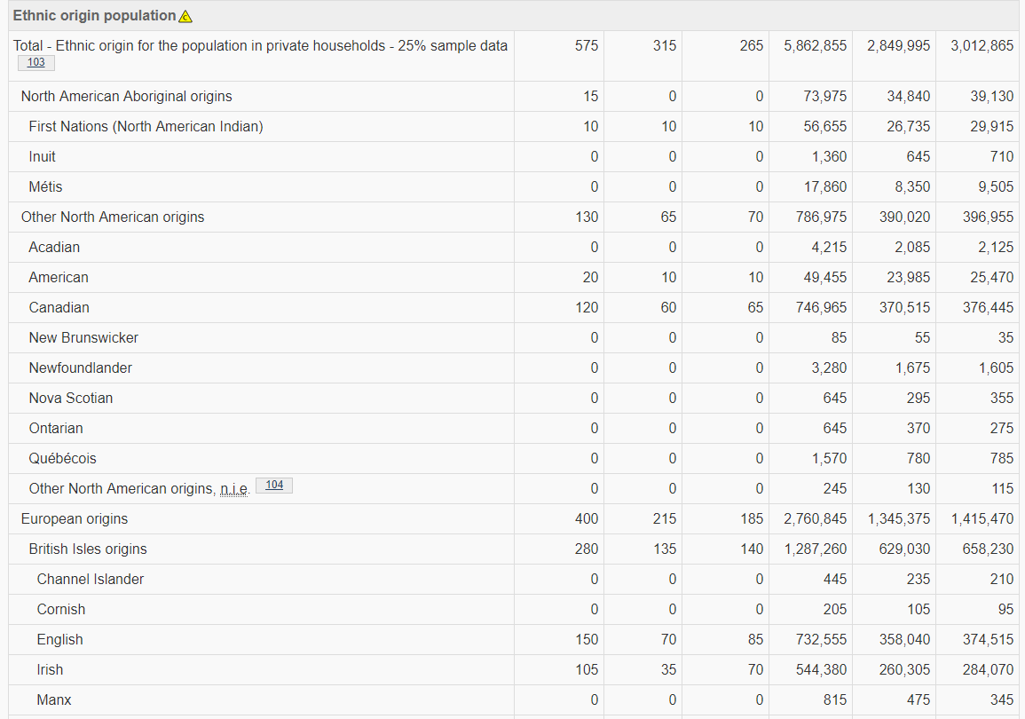
I originally came up with the idea for this visualization when writing an article on the 2018 Ontario election that used StatsCan census data. The census data includes information on ‘ethnic origin population’ by census tract (a very small geographical region, in downtown Toronto it would represent only a few blocks). With this data, and a map of census tracts (available from StatsCan in the form of ‘shapefiles’), I set out to map who Toronto would be cheering for.
The Maps
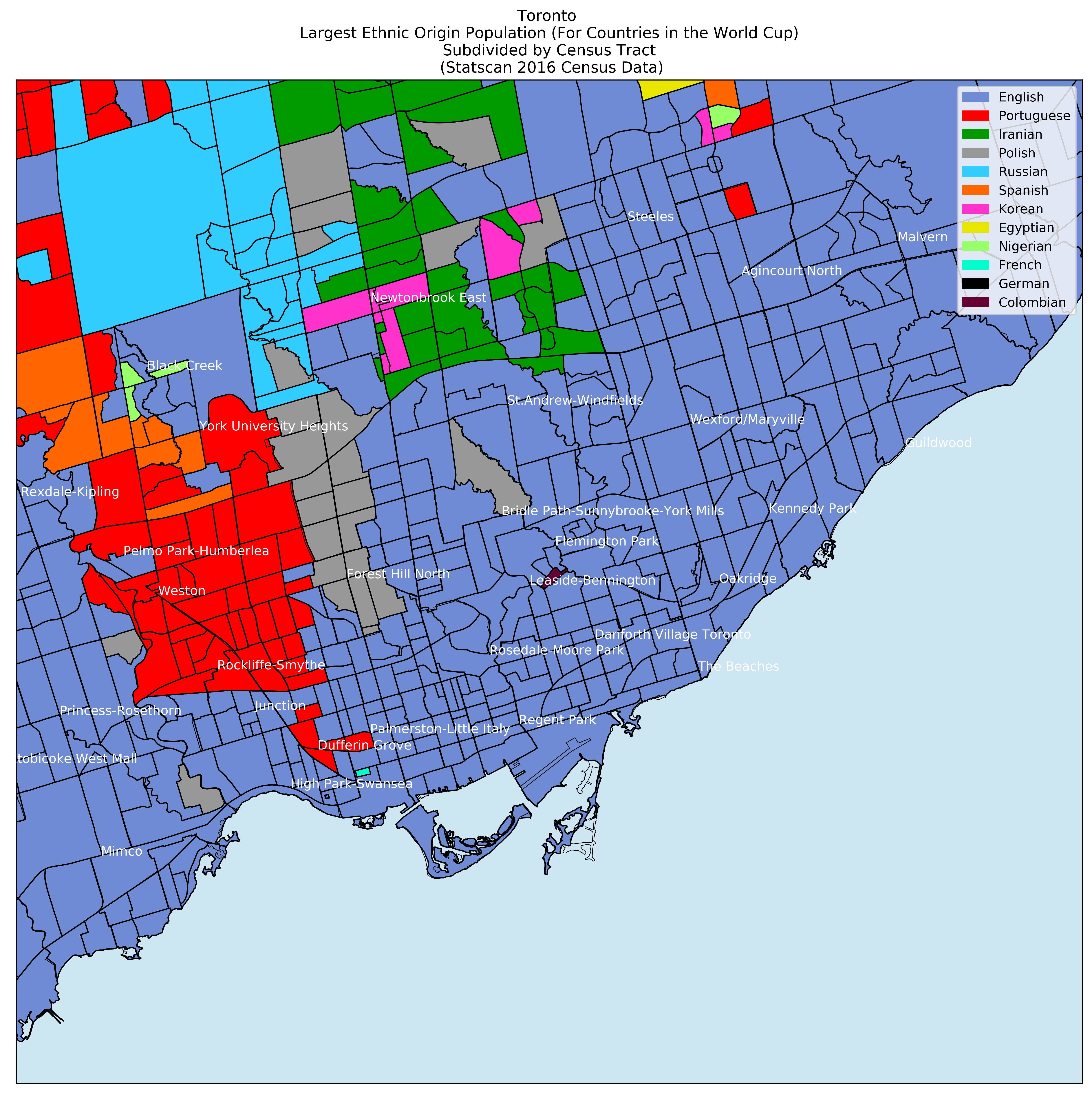
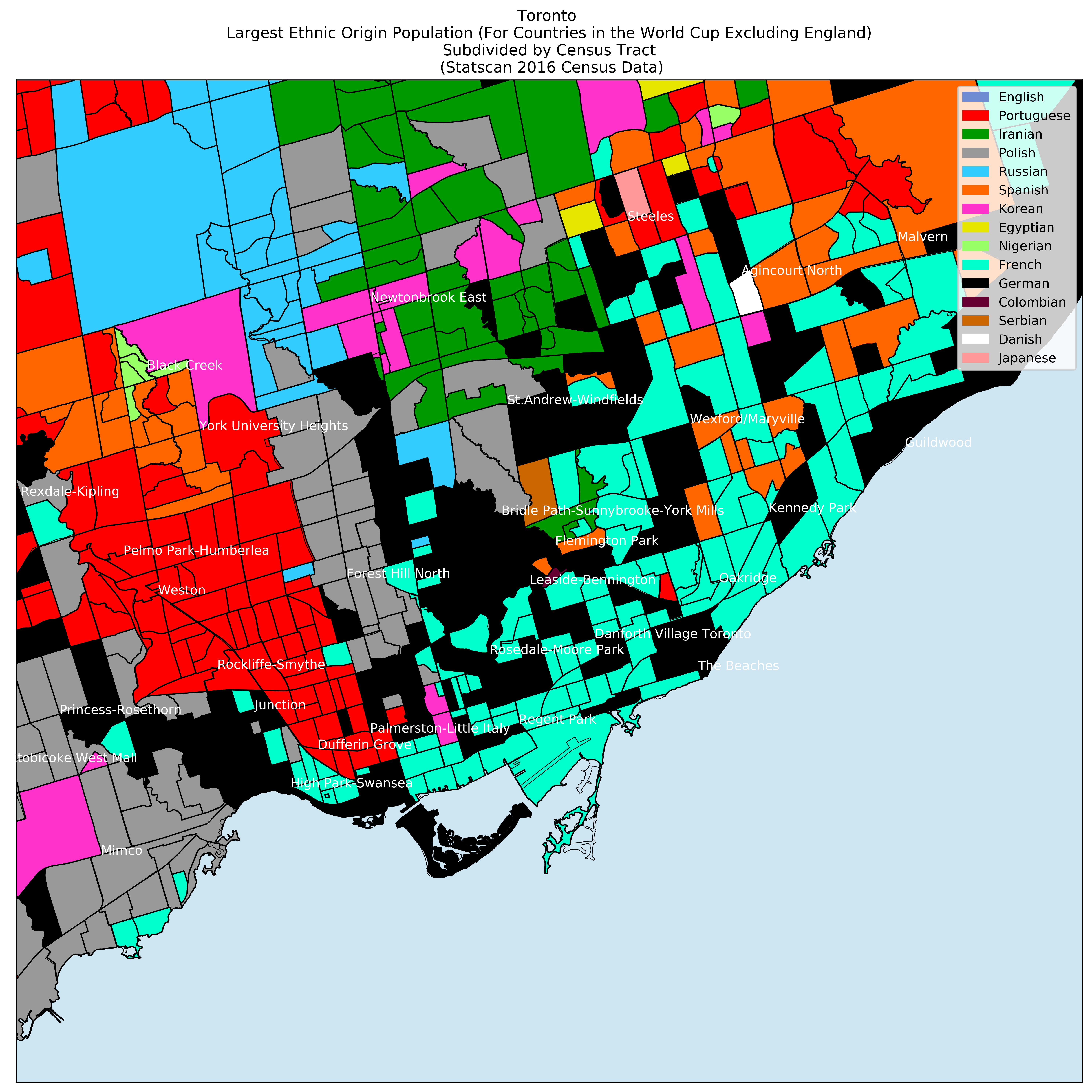
Plotted using Matplotlib Basemap. For each census tract I picked the ethnic origin (of countries in the 2018 World cup) that has the largest population. Note that ‘English’ as an ethnic origin dominates the original map, so I have plotted two separate maps, one including English and one without. Also note, the map would look a little different if Italy had qualified.
As the World Cup progresses I hope to create more maps with only the teams that are left, or create maps for individual games.
Links to high resolution maps at the bottom of the article.
Enjoy!
Reflection/Technical Roadblocks
Coming off the heels of my election analysis I was more comfortable using pandas/matplotlib which made the analysis easier. This was because I had more confidence in what steps I would need to take in order to get the data into the format I wanted. The biggest technical roadblock, which I ultimately had to ‘hack’ my way around, was the 2016 Census shapefile from StatsCan was incompatible with Basemap (in 2016 StatsCan began to publish these files using a new geographical projection). My multiple attempts to convert it into a compatible file failed, so I ultimately had to revert to using the 2011 census shapefile and interpolate data for a handful the tracts. Not an ideal solution, and I have reached out to StatsCan to get the 2016 file in the proper format so I can update the maps using it as the World Cup progresses.
# for printing out large dataframes for exploration/debugging
pandas.set_option('display.max_rows', None)

# for finding the maximum column for a given row of a dataframe
DataFrame.loc[row_index].idxmax()
This analysis once again hammered home the 90%/10% rule; I spent 90% of my time on data cleaning/preparation, and 10% on everything else. All in all, it was a good project for getting familiar with python mapping tools, and practicing data cleaning/prep.
Links